Introduction
SUIT, or Super UI Toolkit is a UI Framework plugin for VueJS. Like many developers I became tired reinventing the wheel but I could never find a Framework that “Suited” my needs. So I thought it would be fun to create my own. The goal of SUIT is to make my development process more efficient by abstracting common components and functionality in a redistributable manner, so they can be easily used in future Web Development projects.
Components
Currently, SUIT has 18 out of the box components. These components and what they do can be seen below:
- Form.Checkbox
- Form.InputGroup – Used for grouping inputs together, this component applies spacing for inheriting components.
- Form.TextInput
- Form.TextArea
- Form.HorizontalInputGroup – Much the same as InputGroup except this aligns input’s Horizontally and not Vertically.
- AnchorArray – Used for grouping anchor elements (Adds spacing between each anchor)
- ButtonArray – Much the same as AnchorArray, This adds spacing between buttons.
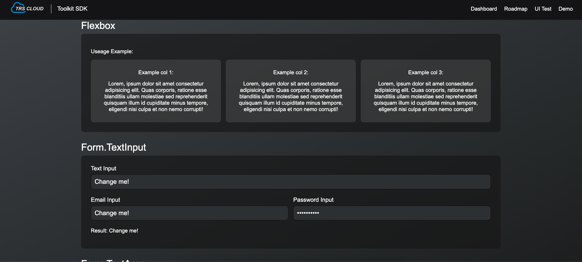
- Flexbox – Dynamic Flexbox component, allows you to create a Flexbox without any CSS.
- ScrollArea – This allows you to add scrolling functionality to a given area.
- Button – Generic button component, supports Multple varients, sizes and different icons.
- IconButton – Icon only button
- DialogInput – An input component specifically customized for the DialogWindow.
- DialogWindow
- DropdownMenu
- DropdownMenuButton
- Header
- MessageBox – This will render a box with a message in it to the screen, again this component has multiple varients.
- Wrapper – Standard wrapper element, contains 3 pre-defined sizes you can choose from.
Testing and Development Tools
In order to test and develop the framework I have a small VueJS app that the plugin is attached to. This app act’s as a form of SDK and contains pages for testing components/typography and listing project information.
Theme Support
One of my first thoughts when starting this project was that it absolutely must contain a system for customizing the look and appearance of the components and prefixes. In previous project’s lack of customization for existing components and prefixes is something that have come back to haunt me. What’s more is that since this is a package we also don’t have any bespoke way of editing it’s components incase we need to customize them. So, with that considered it was important that I built a solid system for customization from the start.
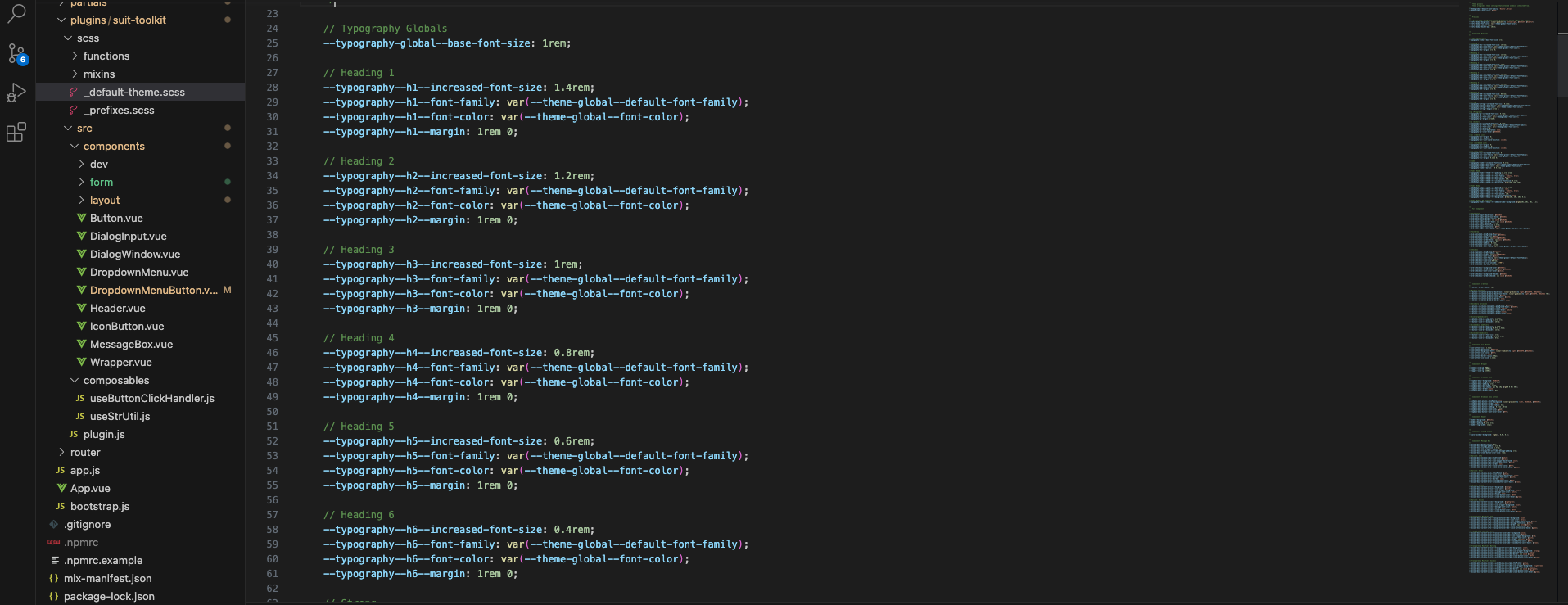
To accomplish this I implemented a theme system using CSS variables. Essentially, each component abstract’s their properties out into variables, which are set through a theme file that is loaded elsewhere in the app. Each component/prefix is carfully thought out, taking into consideration what properties are/aren’t useful for outside modification.
Typograghy and Prefixing
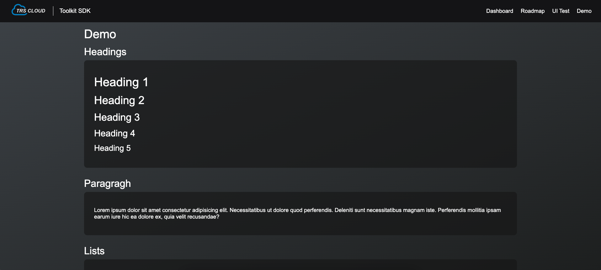
Naturally SUIT wouldn’t be much of a UI Framework without prefixing for our elements. SUIT adds support for prefixing typography elements (Headings, Paragraghs, Lists etc), as well as some other elements used to customize the pages appearance.
Conclusion
Overhaul I’m quite happy with the project and where it is at, much of the goals set have been achieved and it is already proving to be useful in my workflow. One or two components still need to be polished and finalized but it’s at a point where I’m happy. This is something that I will likley be using for some years and as expected will have more features to come. Some ideas I have in mind are as follows:
- Sidebar
- Sidebar Layout – Provides a layout for the sidebar to sit next to our page content.
- Custom Radial Buttons
- Custom Proggress Bar
- Slider
- Button Group – A group of buttons sit next to eachother seamlessly.
- Grid Layout
If your interested in the source code you can find it on my Github: https://github.com/travishughes2002/suit